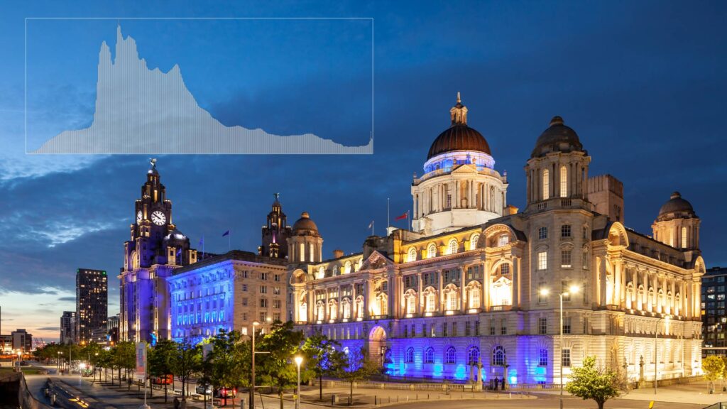
It’s surprising how many photographers coming to my workshops, some with years of experience, never use Histogram in their workflow. When asked about it, they reply “sometimes” or “probably not as often as I should”. All euphemisms for “never”, really. Some admit to using it when processing their images, but not on location.
Whether you belong to this tribe, or you’re a newcomer to digital photography, I’ll endeavour to convince you how important a tool Histogram is. And that you should make it an essential part of your picture-taking routine. Just like checking sharpness or assessing composition on the back screen of your camera.
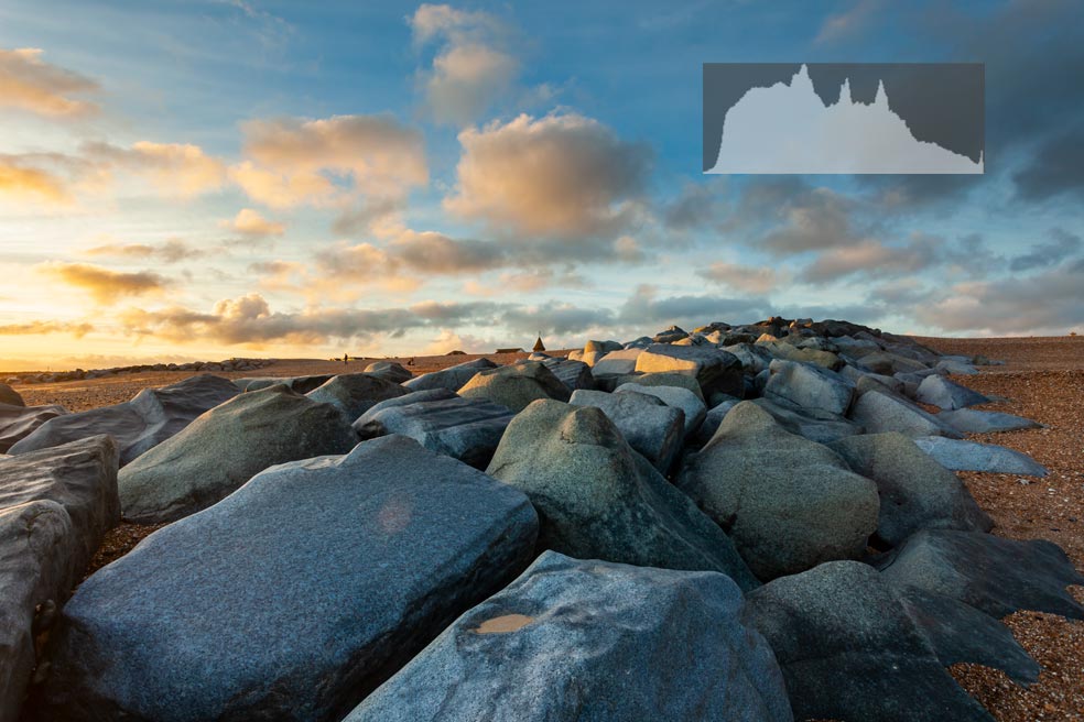
1. Sunset on Shoreham Beach
What are Histograms?
There are great online resources explaining what Histograms are in digital imaging. If the concept is completely new to you, I strongly recommend this excellent two-part article:
https://www.cambridgeincolour.com/tutorials/histograms1.htm
If you don’t have time to read it, here’s the most basic description, for the sake of completeness:
A Histogram is a diagram representing distribution of numeric data. In our context that data is brightness levels in a digital image. The graph has two axes: the horizontal axis represents the camera’s dynamic range – a scale of tones (greyscale) from pure black on the left-hand edge, to pure white on the right. The vertical axis represents the number of pixels at each step of the scale. The higher the bar at a particular step, the more pixels of this brightness level there are in the image.
Histograms don’t indicate where in the image pixels of different brightness levels are. Only the number of pixels at each step of the scale.
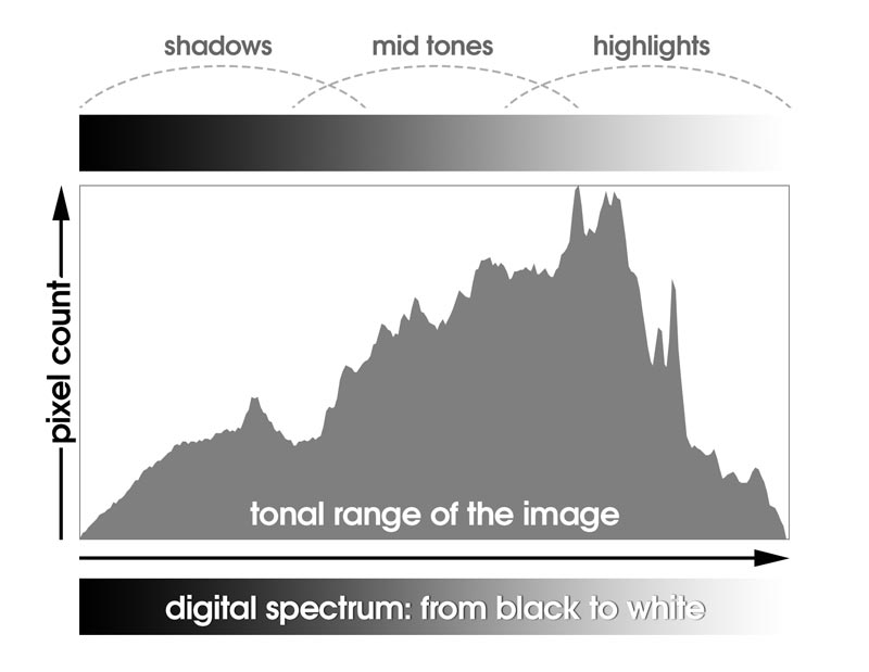
2. Anatomy of a Histogram
But rather than delve deeper into the technicalities and make this post longer and drier than it has to be, I would like to focus on the practicalities of using the Histogram. First, in the next segment, I’ll demonstrate why this tool is indispensable. And then I’ll share an assortment of hands-on tips and describe common mistakes and pitfalls to avoid. All of which, I trust, will help you get consistently better exposures.
Why use the Histogram when taking photos?
Perhaps one of the reasons why so many photographers don’t use the Histogram is that it’s not very exciting. It doesn’t really do anything. It is simply a measuring tool, but an invaluable one. And here’s why:
- The camera’s light metering system is not infallible. Having the metering gauge at zero doesn’t guarantee you’ll get a correctly exposed image. And that’s regardless of the light metering mode .
- You can’t trust the back display to judge whether your images are well exposed. Depending on the camera, the LCD may be overly bright, or too dark, giving you false impressions. Moreover, the display may be automatically adjusting its brightness level to ambient light (a feature you can usually turn off). It will then brighten up in direct sunlight, and grow dimmer when you cup your hands over the camera or walk into the shade.
- You can’t trust your eyes. The same image on the same screen can possibly make a very different impression when viewed in plain daylight. It could appear underexposed or washed out. Then when you check it in a darkened room, it may look vivid and bright. Besides, glaring sunlight will often dazzle you when you’re on location. There will reflections on the LCD surface, causing more confusion or ambiguity.
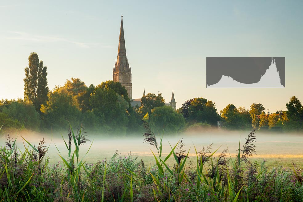
3. Sunrise at Salisbury Cathedral
The tonal content resides primarily in the highlights (the sky and mist) and the shadows (most of the rest of the frame). There isn’t much content in the mid tones – the brighter parts of the vegetation, sunlit face of the cathedral. This tonal distribution gives the image an almost semi-silhouetted character.
But who cares when you can fix it all in post?
Perhaps you can, sometimes. Digital imaging software is getting better and better. And so is most cameras’ noise performance and maybe even their dynamic range, slowly.
But there are always limits to how much you can squeeze out of a botched exposure. If it’s heavily underexposed, you’ll pay the price in exacerbating digital noise when brightening the image. With a grossly overexposed, you may not be able to recover detail from areas in which highlights were clipped to white at all.
Today’s cameras and editing tools give us a lot more wiggle room than a decade or two ago. Still, it’s always advisable to capture the best raw material – an exposure as close to perfection as you can get it. Then your processing afterwards can be less aggressive, and any loss of image quality less likely, or at least less noticeable.
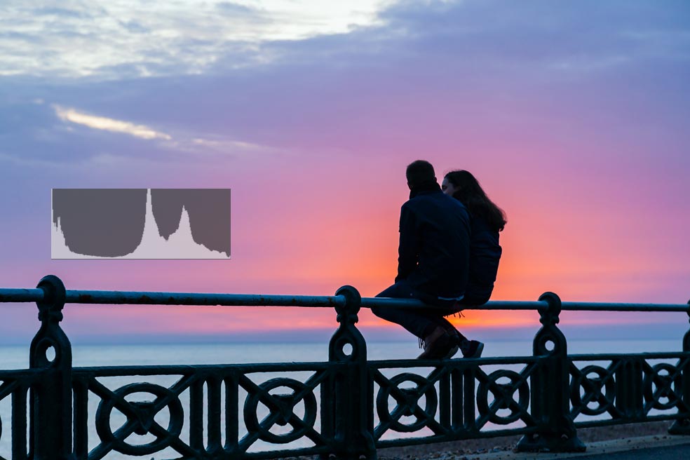
4. Sunset at Hove Seafront
The majority of tones are in the mid tones and highlights – that’s the sky and sea surface. Those areas are represented in the Histogram by the two “mountains” on the right. The rest of the frame (the couple and the railing) falls into the shadows and is represented by the mound on the left. That part of the Histogram is leaning against the edge of the graph and shooting up to the top. This means there are some areas clipped to black (where your naked eye could possibly discern detail, but the camera couldn’t). It’s OK and to be expected here since this is a silhouetted image.
The Histogram in practice
Find the bounds
If you’ve never used it, you first need to find the Histogram itself. In some older cameras it may not be readily available; perhaps you’ll need to dive into the menu and tick a box somewhere. But I promise you, if you have a camera manufactured within the past 20 years, it gives you access to the Histogram…
Once you know how to bring it up, study it in “controlled conditions” – in dim light, when the LCD display is more legible. On some cameras the borders of the graph can be very faint. They could appear nearly invisible when you’re on location. It’s important that you where the edges are, otherwise you will be unable to properly interpret it in the field.
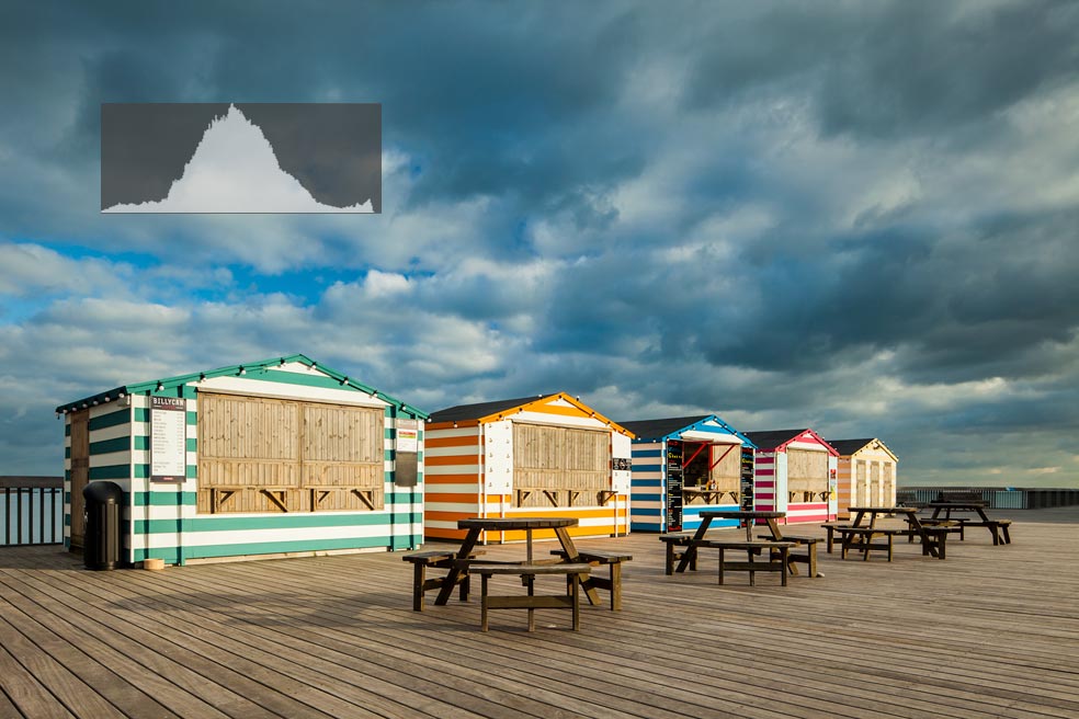
5. Hastings Pier
The Histogram for this image approaches the “ideal bell curve” shape. The majority of tonal information here is in the mid tones and trails off towards the shadows and highlights on either side. But this just happens to be the the tonal distribution in this particular scene at that moment in time, and the Histogram reflects it.
What shape should the “ideal” histogram take?
There is a common belief that the Histogram for a properly exposed photo should take the form of a classic bell curve. While it will indeed sometimes have a similar shape, it is by no means a rule or even a guideline.
There is no prescribed shape for the Histogram. It should instead accurately reflect the tonal content of the frame. Landscape scenes often have balanced tonality. That is, brightness levels are fairly evenly distributed across the spectrum, with the bulk of tonal information residing in the mid tones and decreasing amounts towards the edges of the spectrum. This may produce a roughly bell-shaped histogram.
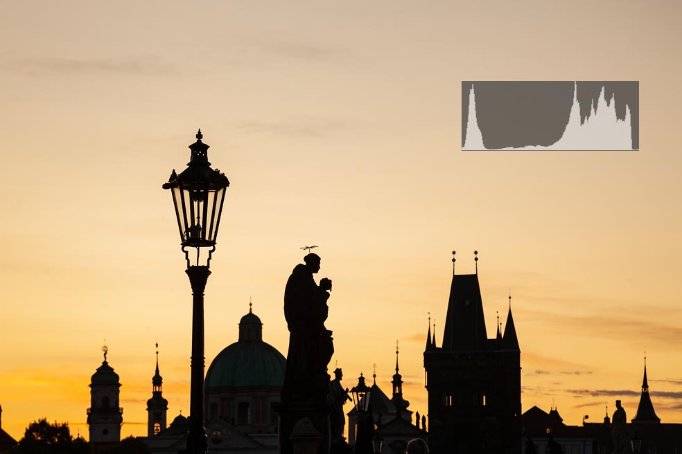
6. Dawn on Charles Bridge in Prague
On the other hand, a correctly exposed silhouetted image will have the majority of its tonal information at the extremes – in the shadows and highlights – and nothing or next to nothing in the mid tones. In this case the histogram may look like an inversion of the “ideal”.
So, how do I know what shape the histogram should take?
I believe the best way to interpret a Histogram is to mentally project the tonal contents of the scene onto the diagram and check if it matches with the actual bars (“mountains”) in the graph. In order to do that you need to subdivide the whole spectrum into smaller ranges. The simplest way to divide it is into: shadows, mid tones, highlights (see fig. 2).
A simple example: if you photograph the sky and the resulting Histogram looks like in the image below on the left:
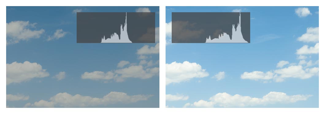
7. Exposing the sky
that tells you the sky is in the mid tones. If you compare it to other elements in your surroundings, you’ll find that the sky is one of the brightest (maybe the brightest). So, it should in fact be represented in the highlights zone of the Histogram. And this, in turn, tells you that you’re dealing with an underexposed image. You need to increase the exposure enough to “move” the sky into the highlights territory (as in the image on the right, in which I compensated the exposure upwards).
Everything is relative
What range any given portion of the image should fall into depends on the context. The same surface reflecting or emitting light with the same absolute intensity could fall within the shadows when taken with a wide angle. But at the same moment, when photographed with a telephoto lens it might become a mid tone or even a highlight. Everything is relative to everything else in the frame.
Squint test
This “mental projection” takes some practice. We usually deal with much more complex scenes than a stretch of blue sky. Our vision has a broader dynamic range that the camera. We also get distracted by colours and details, which can make it more difficult to assess tonal relations between major parts of the scene.
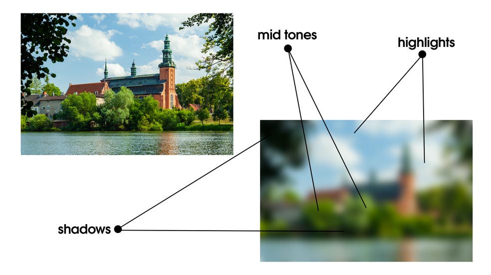
8. Carthusian Monastery in Kartuzy, Poland.
You may find it difficult to judge the tonal balance of the scene and determine which areas should be in the shadows, mid tones or highlights. Intentionally blurring your vision could help you see “the big picture”.
What you might find helpful is to intentionally blur your vision for a moment. You’ll be then better able to appreciate the levels of brightness of different areas in your field of view.
Live histogram vs histogram for exposures already taken
If your camera offers the possibility of using a live Histogram (in the electronic view finder or live view), that could speed up your workflow. It allows you to tweak the exposure before you press the shutter release button.
However, unless the camera is on a tripod, this approach may present some challenges. Live Histogram is updated constantly, several times per second. Consequently, as you move around with the camera, you may get wildly different readings from moment to moment. Obviously, this can be confusing and lead to bad decisions (like unnecessary or insufficient exposure compensation).
Besides, live Histogram is also less accurate, exactly because it’s continuously updated – it has to be an approximation. So, it’s a good idea to check the “static” version for images already on the card, at least now and then.
Highlight alert and a common tendency to underexpose
Most cameras offer some kind of “highlight alert” (or a similarly named feature). You may have seen blinking areas in parts of a photo you’ve just taken when you scrutinise it on the camera’s LCD. The purpose of this feature is to draw your attention to a potential problem – burned highlights. Or in other words, very bright areas that should have some tonal variation and detail, but are effectively clipped to white due to overexposure.
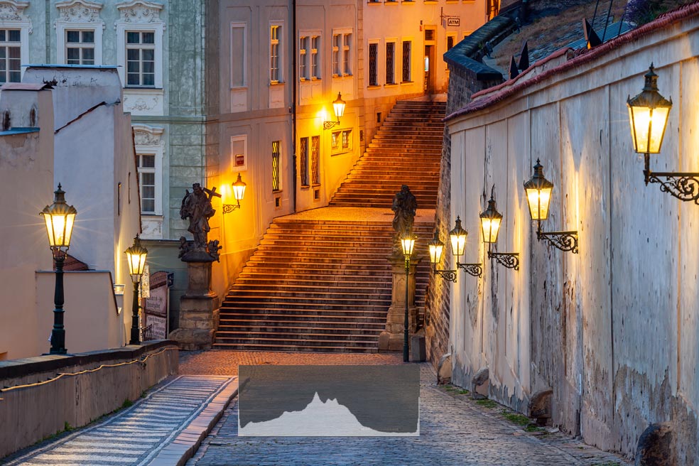
9. Dawn in Prague’s Lesser Quarter
You can probably see the spike on the right-hand edge of the Histogram. It corresponds to the bright light emitted by the lanterns. Those areas caused the camera’s highlight alert to blink. But if I’d decreased the exposure in an effort to avoid it, I would have severely underexposed the rest of the image (probably close to 99% of the frame). Bright light sources in a situation like this appear almost white to the naked eye we can’t really see much detail in those areas. It’s a mistake to try to expose for them at the cost of underexposing the entire photo.
Obviously, it’s a good idea to keep this option on. Yet, it’s not the be all and end all when assessing your exposure. Rather, it’s a reminder to check your Histogram. There is no need to avoid the “blinkies” at all cost. That cost is often too high – you may end up heavily underexposing the rest of the image. You will then be forced to excessively brighten up the shadows and mid tones in editing. Depending on the camera’s settings, its noise performance, the lighting in your scene and other circumstances, this may lead to serious loss of image quality.
On the other hand, if you shoot RAW, you’ll often be able to recover detail in overexposed highlights using basic editing tools. And you won’t deteriorate the image quality in the process. (Unless the entire image is grossly overexposed – which is the number one reason to keep highlight alert on: as a reminder to check the Histogram).

10. Spring sunrise on the South Downs
As in the previous example, a strong source of light in the frame (the sun here) is represented by a spike leaning against the right-hand edge of the Histogram. We can’t stare into the sun, it’s blindingly bright. Trying to lower the exposure to the point of eliminating “blinkies” would be a costly mistake (effectively moving the mid tone substance of the frame into the deepest shadows).
Exposing “to the right”
This concept is closely related to the previous point. I’m not a fan of the phrase itself (“exposing to the right”), but I suppose it sums up the idea in a succinct and visual way.
Sometimes you deal with scenes of high contrast, where the span between the darkest and brightest areas matches or exceeds the camera’s dynamic range. You then have very little room for manouevre and need to get the exposure just right in order to squeeze that contrast within the dynamic range. Sometimes you may need to resort to using graduated filters or other solutions to achieve it.
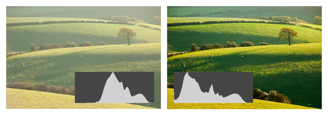
11. November afternoon on the South Downs
On the left: the original unprocessed RAW image. The tonal information in the Histogram is shifted towards the highlights – “exposed to the right”. The picture looks unsaturated and lacks contrast. On the right: processed image; the tonal range of the RAW file is extended across the available spectrum.
In other situations though, the contrast in the frame may be less than what the camera is capable of capturing in a single exposure. This leads to a narrow histogram. If the camera is left to its own resources, the tonal information will most likely be clustered around the centre of the diagram. If that’s the case, it may be beneficial to slightly overexpose the frame (but without burning any parts of the image). The resulting histogram will be removed to the right of centre – from mid tones and shadows towards highlights.
A photo so exposed will possibly look washed out before processing. But if you shoot RAW, it will give you better input material to work with in editing software. To reiterate: for the sake of image quality, it’s preferable to darken an overly bright image when developing, rather than brighten an underexposed one.
Conclusion
If you haven’t used the Histogram, the process of interpreting it may seem difficult at first. Treat it as a puzzle to solve. As practice, try to determine what objects or surfaces around you should fall into shadows, highlights or mid tones if you were to photograph the scene (whether you have the camera on you or not). Use the “squint test” if necessary.
When you are taking photos, study the Histogram for each one. And try to figure out which peaks or troughs in the graph correspond to which areas in the scene. Don’t aim for a specific shape when tweaking your exposure. You can see in the selection of examples throughout this post that the Histogram can take all kinds of forms depending on the content of the frame.
With time you’ll be able to see more nuance. You may then want to create a more detailed mental subdivision of the spectrum. I like to divide it into: blacks, shadows, lower mid tones, mid tones, upper mid tones, highlights, and whites.
I hope you’ll soon discover for yourself what a useful tool the Histogram is and make it an integral part of your process. Good luck!
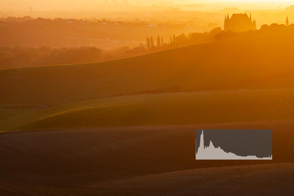
12. Lancing College at sunrise
Thank you for reading. Check out other similar articles in my Landscape Photography is Simple “blog”. Or click on a random post below.
The Falmer Triangle – a photographic guide to the South

